
Is Now The Time To Invest In The TSP I Fund?
The I fund has been crushing the C fund in 2025! The question is, will this outperformance continue and is now a good time for TSP investors to reallocate to the I fund?
In our last I fund article, "The Return Of The I Fund", we talked about its heyday, all the way back in the early 2000s. From 2002 to 2007, the I fund more than doubled the rate of return of the C fund! However, since its peak in 2007, the I fund has underperformed the C fund for almost 20 years.
How To Determine I Fund Outperformance
We have five funds available in the TSP. The C fund tracks the S&P500 index, the S fund tracks the Total Composite Stock Market Index, and the I fund tracks the All World ex-US, ex-China, ex Hong Kong Index, the F fund tracks the Aggregate Bond Index, and the G fund is a money market fund specific to the TSP.
TSP investors allocated to the funds that perform best will see the value of their accounts grow the fastest. We can determine which funds are outperforming the others by using ratio charts of the indexes that the funds track.
Because the new I fund does not have a ticker symbol, we will utilize the old I fund in the charts below as an approximation.
A ratio chart shows the relative price of one fund vs another. When the line is going up, the fund in the numerator is outperforming the fund in the denominator. When the line is going down, the fund in the denominator is outperforming the fund in the numerator.
The ratio chart below compares the I fund vs the C fund. We can see the outperformance of the I fund from 2002 to its peak in 2007, and the outperformance of the C fund through early June 2025.
The market never goes up or down in a straight line. While we can see periods of I fund outperformance from 2007 to 2025, the overall trend is clearly C fund outperformance over this time period.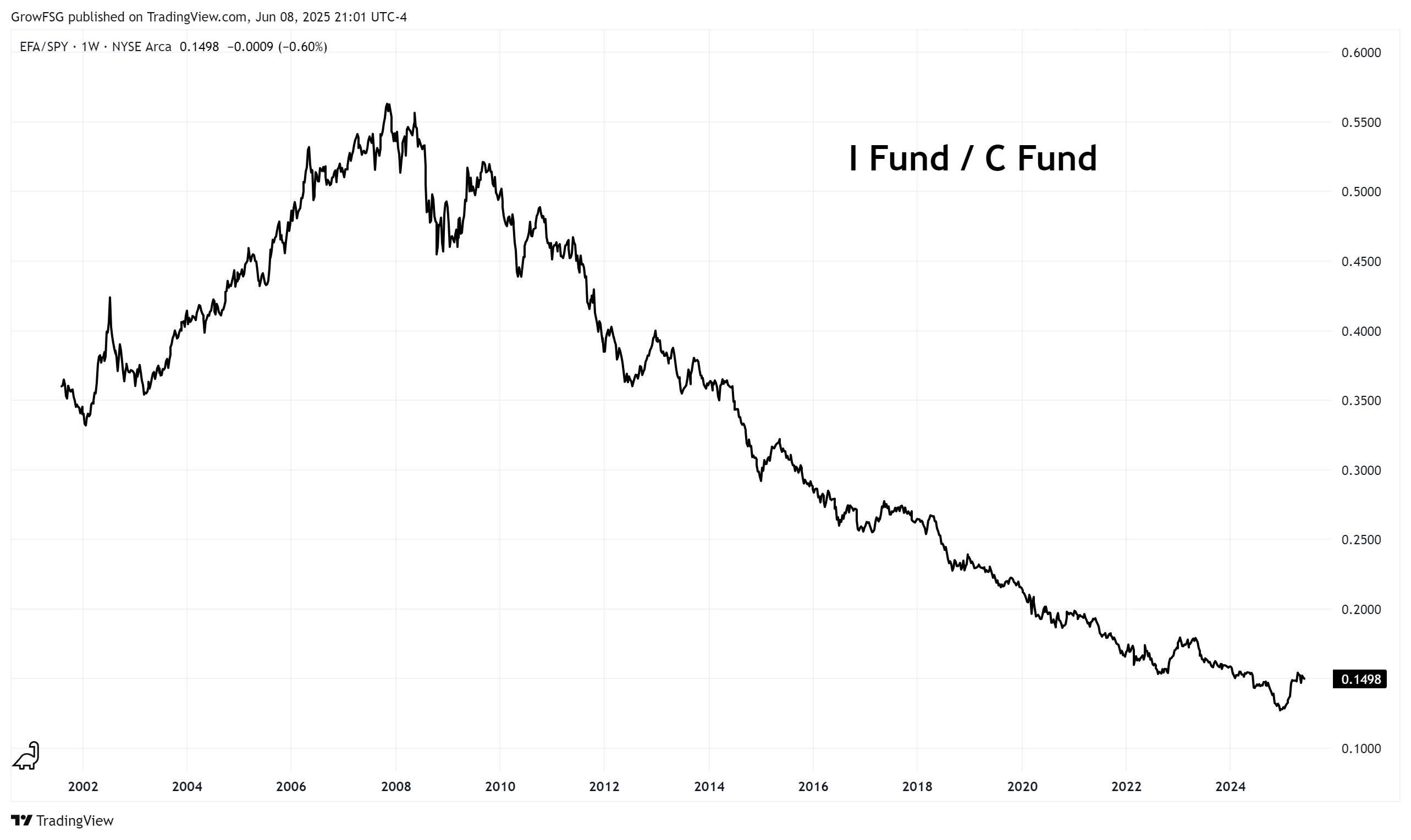
If the long-term trend of C fund outperformance has been in place for almost 20 years, how will we know when the trend has changed?
An uptrend is defined by higher highs and higher lows. A downtrend is defined by lower highs and lower lows.
In the chart above, each significant high is lower than the previous high and each significant low is lower that the previous low. For the trend to change, we need to see higher highs and higher lows. The chart below shows how that could look.
The key is what happens on the next pullback. If the long-term trend continues, the ratio chart will roll over and we will see another lower low. The first indication of a potential long-term trend change will be a higher low on this chart.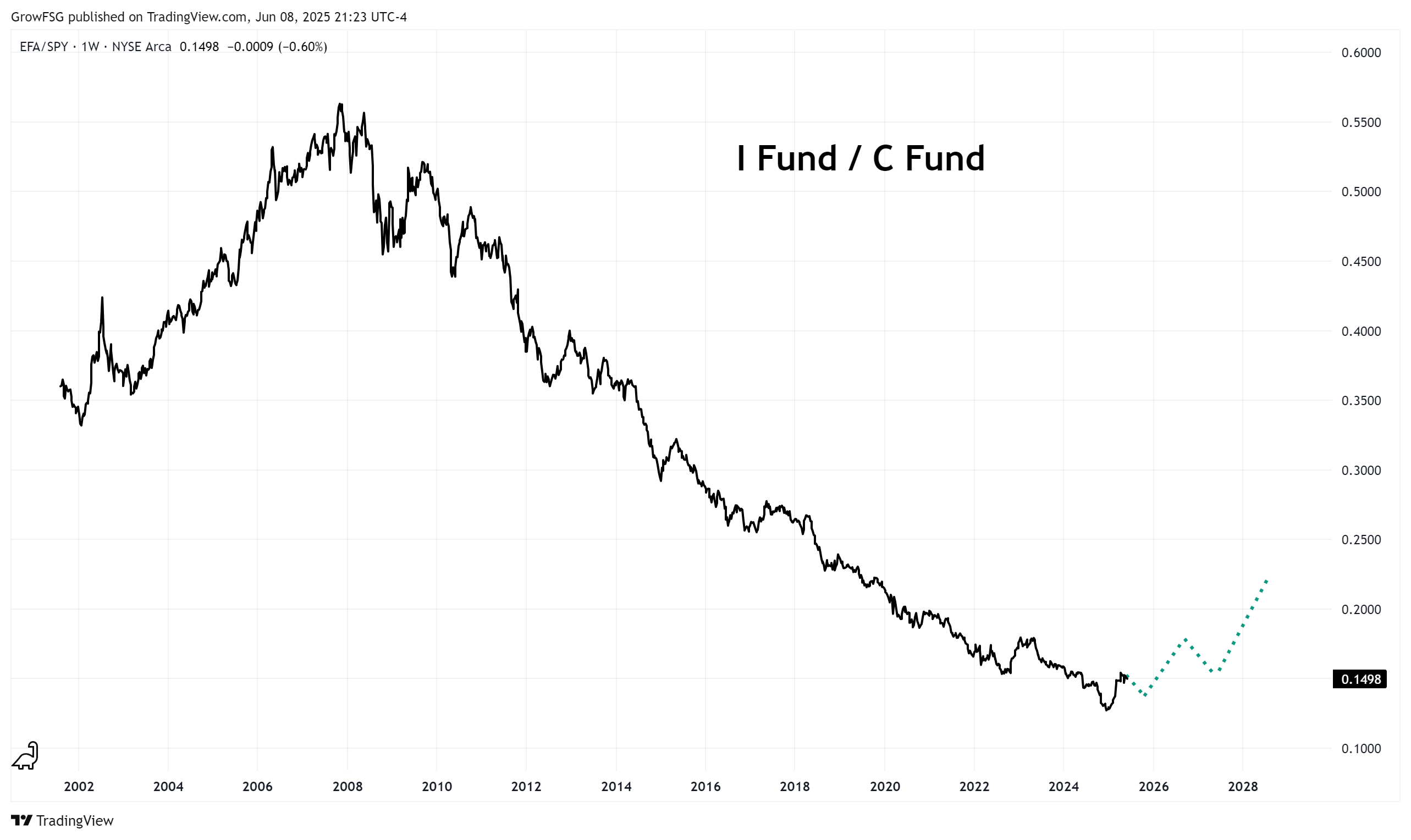
If we zoom in a bit, we can see how a potential trend change could play out. Step one is the Higher Low. Step two is a confirmation of the trend change by establishing a higher high.
There are no guarantees that the trend simply reverses. The pattern could consolidate sideways for a period of time before continuing lower. This chart shows the first and necessary steps of a potential trend change.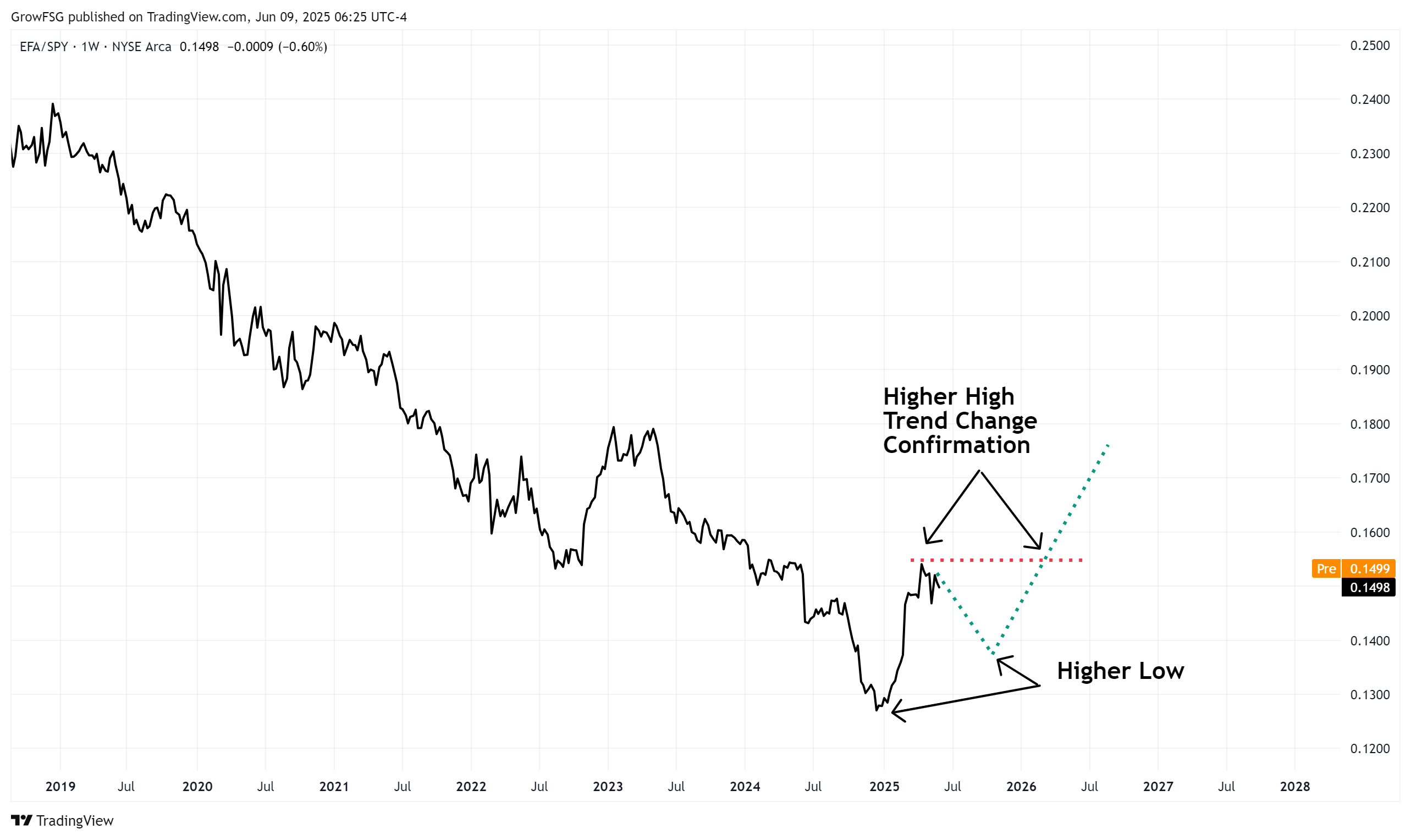
Will I Fund Outperformance Continue?
Will the outperformance of the I fund that we have seen in 2025 continue? It's absolutely possible, but the trend is yet to bear this out.
The chart below highlights numerous examples of brief I fund outperformance over the years. In each case, the long-term trend continued down. The long-term trend of I fund outperformance cannot be established without a confirmed higher low in the ratio.
Is now a good time for TSP investors to reallocate into the I fund?
Currently, the ratio looks to be putting in another lower high. While no one has a crystal ball, this chart is telling us to be patient. If the ratio rolls over, C fund outperformance continues.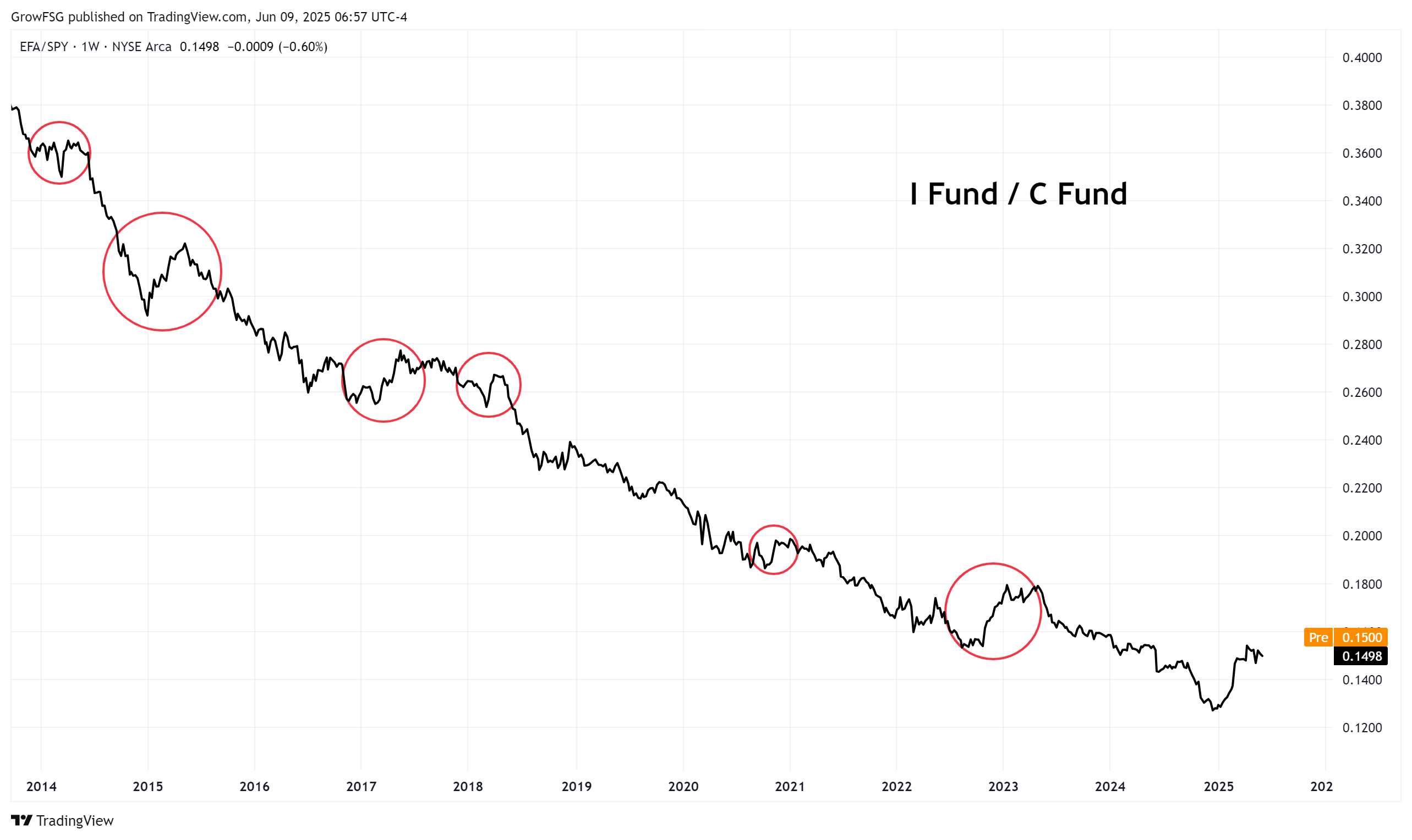
Bottom Line
The trend, as they say, is your friend. While the I fund has outperformed the C fund throughout 2025, the long-term trend continues to be C fund outperformance.
The first requirement for a potential trend change is a confirmed higher low in the ratio chart. A higher low, followed by a higher high, would confirm the change in trend.
Ratio charts are extremely valuable in making TSP reallocation decisions. They can be used to compare any of the TSP funds to help investors select the funds that are outperforming and avoid those that are underperforming.
Ratio charts are just one important tool in the technical analysis kit. For more valuable tools and insights, sign up at GrowMyTSP.com.
-----------------------------------------
GrowMyTSP.com does not provide personal investment advice. We are an education and analysis service, helping TSP investors grow their accounts using strategies and models that best fit their personal circumstances and risk tolerance. Get started at GrowMyTSP.com.
